Context
Editor is one of the most crucial elements for any forum-based community. At Habitate, we have always given priority to the editor from the beginning and now we have further enhanced our Rich text editor to increase efficiency and bring in additional convenience factors for the users to express without any difficulty.
The team behind Rich Text Editor 2.0
This step to upgrade and develop the editor was undertaken by our design and engineering team. Both engineer and designer worked relentlessly, got into a couple of iteration sessions, discussed with the team, and brought this version live from just an idea in a short span of time.
What’s New?Experience a whole new version of Habitate editor and the interesting changes brought into the UI. Below are some of the new changes to our Rich text editor 2.0
1. Larger writing space
2. Toolbar visibility
3. Tool grouping
4. Removal of “discard” and moving “channel selection” to pop-up
Get to know how our RCT 2.0 looks and works.
1. Larger writing space
To enable users to express themselves, a larger writing space will be the most sought-after option.
The new version
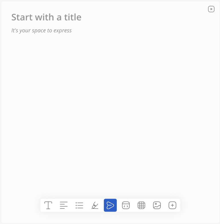
The editor page starts with the title and the body of the content right below. A post button at the end of the page is placed. Once the customer starts writing, all editing related tools will appear and if the customer clicks outside the page, the tools go invisible.
Why change?1. Community is all about conversations and content. So, the more space, the more users get the freedom to express themselves better.
2. Toolbar visibility
The toolbar is a section that consists of an array of tools for you to use if and when necessary. In this case, the toolbar will have tools that will help you write content. It went through a major transformation to make sure it is super user-friendly and effective.
Before | After |
|---|---|
The toolbar was always visible above the body content for customers to click on it at any point in time while writing. | Post transformation, the toolbar only appears when the customer is typing, as people will not need to see the toolbar unless they want to edit while writing. |
Why change?1. New version of the toolbar has eliminated the separation between the title and the body content, so that content continuation goes smoothly
2. It is important to have space to write first, this change has provided more space in the editor3. The concept of show when necessary excites the user and also reminds them that they have an option to use the necessary tools
3. Tool grouping
Toolbar has all the necessary tools a customer would need while writing their content. But, the customer will not need all the tools at one instance as each tool performs a specific different action and grouping will minimise the fatigue of too many options spread across the toolbar. Therefore, making it easier to use.
Before | After |
|---|---|
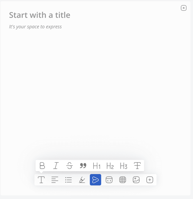
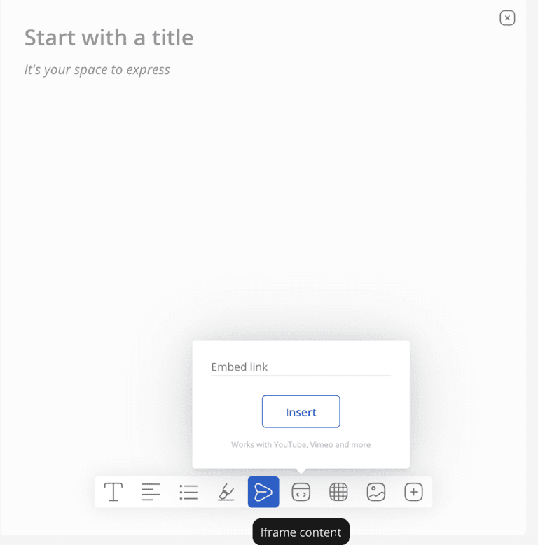
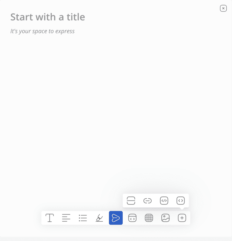
All tools were displayed in a row above the content, where customers could click and use the tool to edit when they write content on the editor. | Tools are now grouped with relevant tool actions under one icon. For example, Bold, Font style, and font size, and others come under ‘text formatting’; align right, left and center come under ‘alignment’. You can also notice editing options on the left side of the post icon on the toolbar, while inserting tools have been placed on the right side of the post icon, making it easy for the customers to track their needs of action. |
For text editing options
# Text formating
#Align

#Bullet

For inserting options
#Embed
#Table

#Image
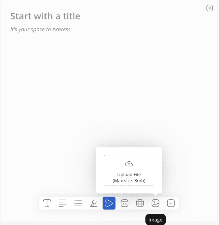
#Inserting links and codes
Why change?
1. Removing clutter and fatigue to choose the best among too many options to edit
2. Increase usability of these tools so that the content shared on community stands out and any day formatted content is viewed and engaged more3. Prioritising tools on the toolbar makes users’ experience comfortable
4. Removal of “discard” and moving “channel selection” to pop-up
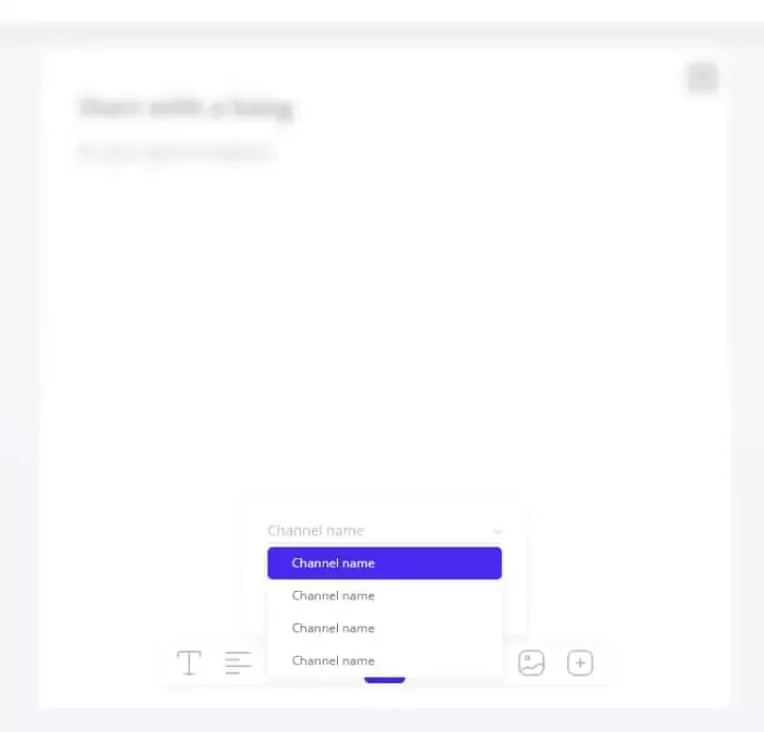
Discard and channel settings box which was below, on the editor’s page has been removed now. Channel selection has been moved to the end of the post as a pop-up so that users are allowed to post content and then select the appropriate channel.
Before | After |
|---|---|
Rich text editor had a channel setting dropdown in which you could select what channel your content can be posted. There was a discard button next to the post for the customer to delete content if they don’t feel like posting the content. | From now on, a pop-up box appears when the customer clicks on the post button. And, this is where channel selection appears. By that, the user clicks on the relevant channel that appears on the pop-up section and then clicks post. |
Why change?
1. Helps users think about the right channel to post before publishing. This means users will avoid posting in wrong channels
2. If a customer doesn’t want to post content, he can simply click back and the content directly gets discarded.
Inspiration behind: Freedom to express, Do things at your will, Converse with zeal
Every change is inspired by something that created an impact. The entire editor was built from the perspective to freely express and converse with fellow users - an innate factor of community.
The toolbar being visible when clicking on the space to express was set in the context of a bird opening up its wings when it needs to fly.
Community is all about interactions. In order to make a user feel he or she is not alone even while expressing their thoughts, design has been made interactive. For instance, tools open up like a chatbox to give the user a feeling that an editor page is a person and that he’s working with that person.
Hope our new version excites you. Do share your feedback with us.


 Habitate